


Income inequality in the UK
No effects of Brexit yet, but then it is still early days.

Spoiler: This is a first of (hopefully) several future posts about inequality in the UK after Brexit. Brexit came into effect 2020 so the data, stretching to 2022 or 2023, does not yet reflect the effects of Brexit. It will take a few more years before it becomes visible. Also, other things blur the picture, such as the COVID pandemic and the fascist regime in the Kremlin’s genocidal war against Ukraine.
Anyway, below are some graphs and tables showing the developments of indicators of income inequality. Income inequality, measured as percentage changes in equalised incomes across incomes with different levels of incomes, has increased the last few years. It has however, been stable for two decades which several indicators show. The share in all incomes for the top 1% income households have remained constant since the beginning of the Millennium. The Gini-coefficient has also remained constant during the same period. Labour and capital shares in GDP are also relatively stable over time.
Brexit and income inequality
Will Brexit affect income inequality? In general and on the aggregate level of the economy, the implications of Brexit on GDP per capita growth, competion on markets, innovation, and inflation seem clear. Compared to a situation within the EU, lower trade will, through different channels, lead to lower growth, weaker competion, innovation, and higher prices. Higher prices will, in combination with lower productivity growth, suppress real wages compared to a situation within the EU.
Lower trade also impacts the division of income between capital and labour. Weaker competition on Britsh markets, due to lower imports, means that the domestic firms are able to increase their markups and earn larger profits. This implies an increasing share of capital in GDP at the expense of labour’s share.
The increasing share of capital in GDP should also show up in income statistics for households as wages and salaries make up the lion share of their income. The above suggested development also implies increasing capital incomes. Since the major share of capital incomes is earned by high-income households, incomes in the higher end of the income spectrum should increase, e.g. the top 1% share in total incomes.
Income concepts
To analyse income inequality developments, one needs to have at least a basic understanding of income statistics. The British statistical service, Office for National Statistics (ONS) uses the following major income concepts.
Original income = wages + entrepreneurial income + other income + benefits in kind paid by the employer + investment income + private pensions, annuities
Gross income = original income + benefits paid by the state
Disposable income = gross income - direct taxes.
A more detailed view is provided by the screenshot from the ONS below and their own description here.
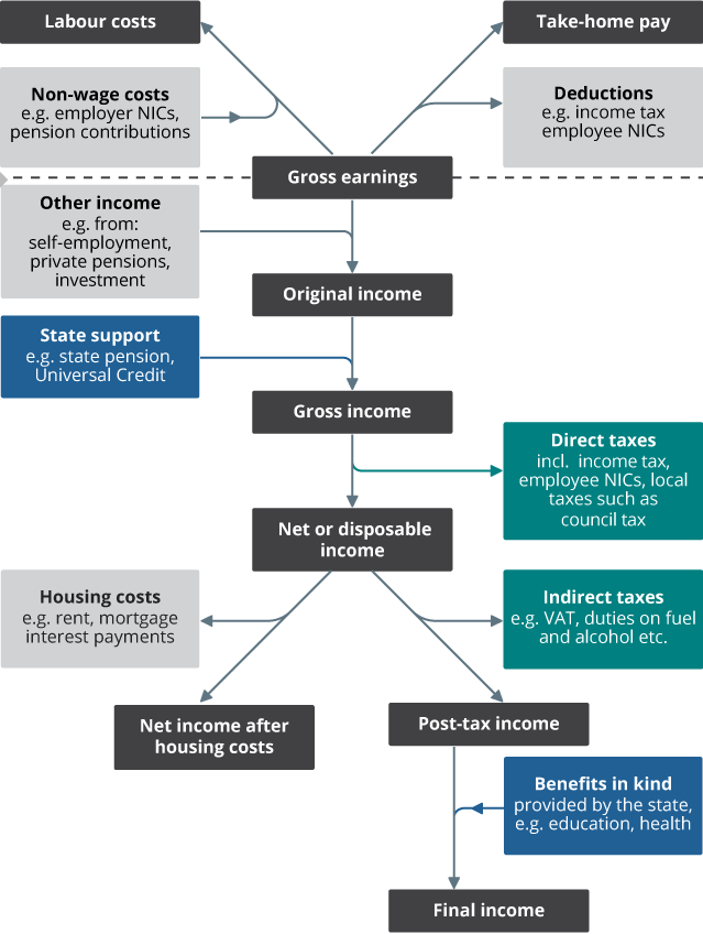
Source: Office of National Statistics. Income and earnings statistics guide.
The income concepts differ from the ones defined by Swedish statistics. It is not straight forward to calculate factor income shares as I did in my post on Swedish income inequality. I will stick to the UK income concepts.
Income inequality has increased slightly the last years but remains stable for the last two decades.
Brexit has had no visible effect on the distribution of orginal income. The largest share is made up by wages and salaries. It has increased by seven percent (five percentage points) since 2016, (an ad-hoc choice by me), and is heading back to its 2002 level. Other shares also appear to be stable over time though some developments during shorter time periods are relatively large. The second largest share in orginal income is held by self-employment income. During the time period that the share of wages and salaries increased, the self-employment income share decreased by 19% which looks big but is only two percentage points. The investment income share almost halfed as it shrunk from 7.4% in 2016 to 4.3% in 2022. The share of private pension, annuties, remained constant. The remaining two shares are insignificant.
Income shares in UK original incomes 2002-2022. Percent.
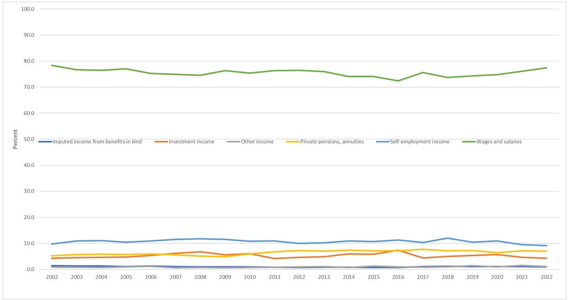
Source: Office of National Statistics. Note: Capital income includes investment income and private pensions and annuities. Capital gains are probably included in investment income. Data in 2022 prices.
Moving on to gross income, Brexit effects are absent here too. Gross income can be divided in three major sources of income, wages, capital and transfers. The wage income share is made up by the four first sources of orignal income mentioned in the definition above. The capital income share is made up the two last sources of income in original income. Adding benefits paid by the state yields gross income.
Since wages and salaries weigh more than self-employment income, the share of total wages increases. It is back on the 2002 level. Since the capital income share in original income decreased, it decreases also in gross income. The share of transfers in gross incomes has decreased by more than two percentage points over the last six years. It is now at its lowest level since 2002.
Income shares in UK gross incomes 2002-2022.

Source: Office of National Statistics. Note: The wage income share includes imputed income from benefits in kind and other income. Capital income includes investment income and private pensions and annuities. Capital gains are probably included in investment income. Data in 2022 prices.
The transfer share can decrease for many reasons. Higher growth decreases transfers as fewer people are unemployed and find it hard to make ends meet. Constant or lower transfers in monetary terms imply a falling share as other sources of income tend to increase over time.
Income inequality in terms of equivalised disposable incomes has not increased since 2002 if one looks at the the top three income deciles. However, the share of the lowest income decile group in total incomes has decreased by 13% since 2002. The shares of income decile groups in between has increased. Overall, income inequality remains stable in the UK.
Income decile groups’ shares in total equivalised disposable incomes in the UK 2002-2022.

Source: Office for National Statistics.
This picture is confirmed by a graph of the top 1% together with the GINI-coefficient. The 2022 GINI is slightly lower than in 2002, while the top 1% share is slighly higher. It appears however that inequality has increased the last years.
The GINI-coefficient and the top 1% income’s share of all incomes in the UK 2002-2022.
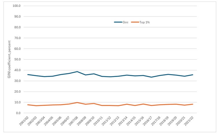
Source: Office for National Statistics. Note: Unequivalised incomes.
The falling share of the bottom 10% in total equivalised disposable income is a consequnce of the falling transfer share in gross and disposable incomes.
While I focus on a relatively long period of time, the ONS reports changes every year as new data is published. In its Statistical Bulletin, they observe that inequality between 2021 and 2022, and reached its highest level for ten years in 2022. Whether inequality has increased or not, sometimes depend on your choice of the length of your time period. Inequality has increased the last years but has been stable for around 30 years. Going back to 1977 which is the oldest data I could (easily) find on the ONS website, reveals that inequality has increased since then.
Capital and labour shares in GDP
Finally, let us have a look at shares in GDP. In the beginning of this post, I rambled about capital and labour shares in income. According to my ramblings, Brexit would tend to lower the wage share and raise the capital share in factor income. The capital share, which is calculated net of depreciation, has increased slightly since Brexit came into effect. At the same time, the labour share has decreased by 0.011 percentage points which is nothing over a longer perid of time. It is too early days to tell.
Shares of wages, capital and depreciation in GDP at factor cost.

Source: DG ECFIN AMECO Database, European Commission.
So, all in all, this was a rather meaningless blog post. Nothing has changed. We will se what the future holds as I come back to this issue.